Accessibility tips
This article was first published in Envato tutorials site: Accessibility Tips for WordPress Theme Developers.
In a previous article we talked about why accessibility matters, in terms of business, SEO, usability, and even the law. In this article I’ll explain how to create accessible WordPress themes, though the same ideas apply to any platform.
An Overview of Accessibility and Inclusive Web Design
There is no way we can cover all the possible best practices in this article, but the basics remain true for every website. I’ll use couple of resources as the back bone of this article:
- Heydon Pickering’s fantastic inclusive web design checklist on Github.
- The WordPress Theme review team’s required guidelines for creating accessibility-ready themes.
- Recommended reading: creating accessible WordPress themes.
We’ll cover the following tips:
- Use Semantic HTML
- Structure With HTML5 Sectioning Elements
- Make the Headings Hierarchy Clear
- Navigate the Page Using Assistive Technology
- Consider Keyboard Navigation and Focus Styles
- Check for Color Contrast
- Remember Skip Links
- Avoid Repetitive Link Text
Use Semantic HTML
I can’t emphasize enough the importance of semantic HTML: it’s the foundation of your accessible website. Léonie Watson explains perfectly what semantics means in her article understanding semantics:
“HTML semantics are therefore important in two ways: We get a consistent understanding of content structure and native behaviour, and we get a common understanding of the content’s meaning and purpose. The best thing of all, is that we get those things for free whenever we use HTML as intended.”
Léonie Watson
When we are writing HTML elements we should not only think about how they are designed, or how they look. We should also think about how they work
- with the keyboard.
- when clicked or tabbed.
- with the accessibility API and assistive technologies (AT) like
- screen readers
- screen magnification software
- speech recognition software
- head pointers
- with all different browsers and devices.
One very common example is the usage of <a>, <button>, and <div>. We’ll use these to illustrate my point.
When to Use <a>
Use <a> (an anchor tag) when you are creating a link to another page, file, email, or an anchor on the same page.
- Good example:
<a href="https://developer.mozilla.org/">Mozilla</a> - Good example:
<a href="#back-to-top">Back to top</a>. - Bad example:
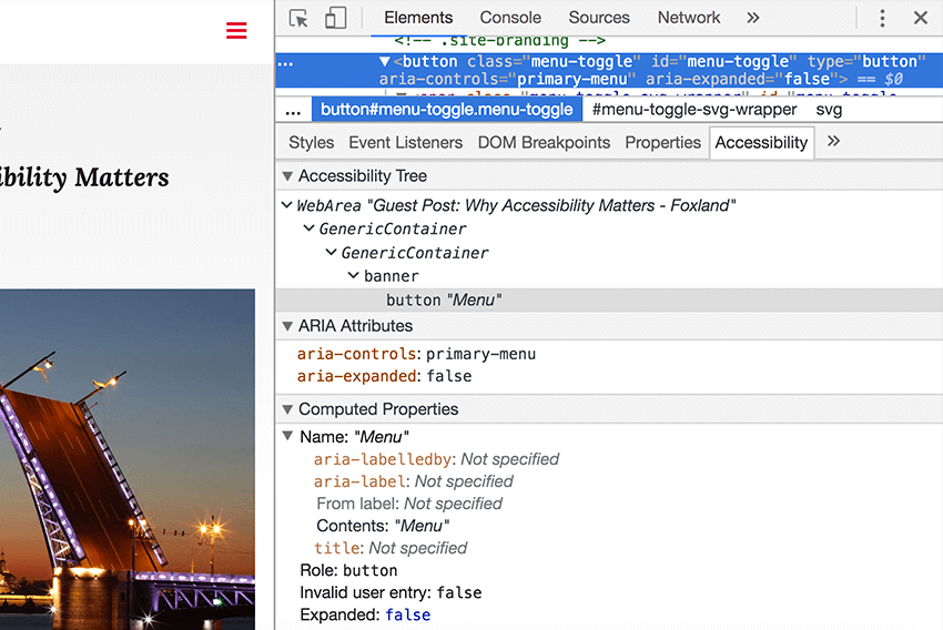
<a href="#" class="menu-toggle-button">Menu</a>. This should be<button>.
Note: behind the scenes the accessibility API provides information to assistive technologies about each element’s name, role, and state.
Firefox and Chrome have build in Accessibility inspectors.

In practice this means that screen readers and other AT recognize the anchor and can announce the role and name of the element. For example: “Link, Building an Inclusive Web: Why Accessibility Matters”.
They can also navigate the page using only the links:
When to Use <button>
Use <button> when you need to trigger an action, like opening a menu. This video from Rob Dodson explains why this situation calls for <button> instead of <div>.
To sum it up, the <button> element has all the following benefits built in already:
- Native keyboard focus.
- Native role of
button, which help AT users understand it’s an interactive element. - It can be triggered with Enter or Space without adding any extra JavaScript.
- It can use the
disabledattribute, for when the button shouldn’t be interactive anymore.
Tip: In Chrome 64 there is an Accessibility pane which shows you a selected element’s position in the accessibility tree, as well as its ARIA attributes and computed properties.
When to Use <div>
Use <div> when you need an element for styling purposes. Naturally, first check if there are any native HTML elements which would be better. For example <article>, <nav>, <p>, <blockquote>, <figure>, <table>, or <ul>.
Read more about Links, Buttons, Submits, and Divs by Adrian Roselli.
In the next section we’ll take a look HTML5 sectioning elements and what semantic markup looks like.
Structure With HTML5 Sectioning Elements
Many HTML5 elements define ARIA landmark roles by default. These identify sections of a page and help AT users navigate to each one. For this reason all content should be inside semantically meaningful elements in order that it isn’t missed by the user.
These are the most common landmark elements:
| HTML5 element | Default landmark role |
|---|---|
<header> | banner |
<nav> | navigation |
<main> | main |
<aside> | complementary |
<footer> | contentinfo |
Note: older browser and AT combinations don’t necessarily recognize HTML5 elements and map them to the correct landmark roles. In these cases you can add roles manually like this: <header role="banner">.
For more information check example markup on the WordPress handbook page about ARIA landmarks and the ARIA landmark examples page.
Make the Headings Hierarchy Clear
Have you read a really long article without headings? Did you find it hard to read? I certainly have. Headings helps users quickly scan and understand page content. At the same time headings give AT users a way to navigate the content and define page structure.
Approaches vary, but my recommendation is the same as that outlined in headings structure in theme development:
- Use only one unique H1 per page. For most themes this would be the post, page, or archive title.
- Use H2 through H6 to divide sections of the page, like widget areas.
- Don’t skip heading levels because that can be confusing when navigating content using headings. This means that after H2 comes H3, not H4.
Note: users can break heading hierarchy when entering their own content by using H1 or skipping heading levels. Advise them by pointing them to our documentation on how to use headings in the content.
I use these tools for checking headings structure:
Navigate the Page Using Assistive Technology
So far we’ve mentioned several ways to navigate the page: using links, headings, or landmarks. And the same goes for other semantic HTML elements like lists, tables, or images.
Assistive technology users can also navigate using these elements.
Read more about using Voiceover or check out this similar article using NVDA.
Consider Keyboard Navigation and Focus Styles
Rule number one: do not remove outline styles by using :focus { outline: none; }!
There are lots of users who are keyboard-dependent and can’t use a mouse. For keyboard users it’s crucial to have visual focus styles on all interactive elements: links, form fields, buttons and so on. In other words, users must be able to see which interactive element has the current keyboard focus when navigating through the page. Most common keyboard controls for navigating are Tab, Shift + Tab, Enter, Space, and arrow keys.
Note: default browser focus styles are not always the most accessible solution—custom outline styles are sometimes better.
Also note: Sometimes outline styles aren’t the best design approach because outline doesn’t respect an element’s border radius. One solution is to use box-shadow instead, but… focus styles should work in all scenarios, like in Windows High Contrast mode which removes box-shadow styles.
Here is nice trick which uses a transparent outline for Windows High Contrast mode.
:focus {
   box-shadow: inset 0 0 0 1px #6c7781;

   /* Only visible in Windows High Contrast mode */
   outline: 2px solid transparent;

}
You can read more info about this from Gutenberg PR 5138 and Trac ticket 41286.
On the other hand keyboard navigation is not only about focus styles. All actions must be possible with keyboard as well.
One common example is when a user can’t navigate to sub menu items using either the tab key or by using arrow keys. Underscores starter themes have JavaScript solution for this: each time a menu link is focused or blurred, they set or remove the .focus class on the menu link. See toggleFocus function.
Check for Color Contrast
I still see many designs with low color contrast. This can make it impossible for color blind users, users with poor eyesight, or users using low quality monitors to read the content.
Contrast between background and foreground colors should have contrast ratio of
- 4.5:1 for normal text.
- 3:1 for large text (24px equivalent or 19px equivalent and bold).
There are many tools for checking color contrast, like contrast ratio checker.
You’ll find more information in articles such as this one on use of colors and color contrast as requirement for accessibility ready themes.
Remember Skip Links
A “skip to content” link enables a way of jumping past all extra elements before the main content, and heading right to the content. You might be wondering why landmark <main> is not enough since AT users can navigate to main content using landmarks? In fact, the skip link’s main target group is keyboard users, who probably don’t use any AT devices. So they don’t have shortcuts to <main> or other landmark regions.
In any case, AT users still use skip links according to this screen reader survey:
“It is important to note that while usage has decreased among screen reader users, “skip” links still provide notable benefit for other keyboard users.”
Read more on how to use skip links in the handbook.
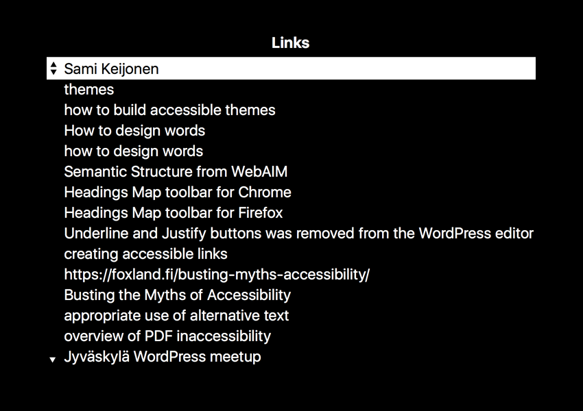
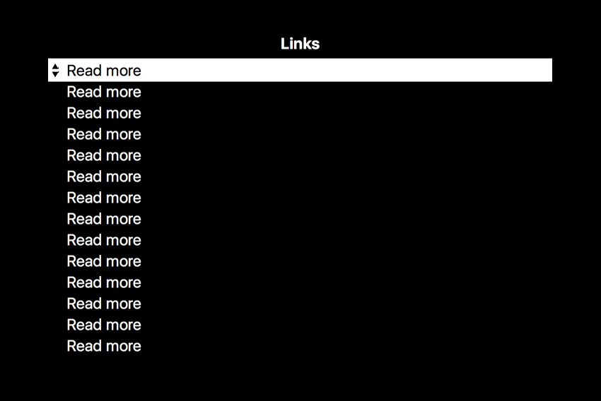
Avoid Repetitive Link Text
Try to avoid repetitive link texts like “Read more” or “Learn more”. For screen reader users who navigate using links the result can look like this:
Conclusion
We’ve only touched the surface of accessibility in WordPress themes, but hopefully this will get you started. Semantic HTML and wise use of CSS go a long way.
Remember to check all the accessibility guidelines for themes and read more tips in the accessibility handbook.